During the last weeks we have worked on a couple of minor changes you won’t see because most of them are under the hood or not released yet. However, two of the released ones are probably important to you.
 Average response time chart
This was something we were planning to do, but there was never enough time to make it done.
So we finally did it in the middle of our work for a major change of the whole downtime alert system (which is going to be released soon) to get a brake and freshen up our minds.
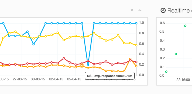
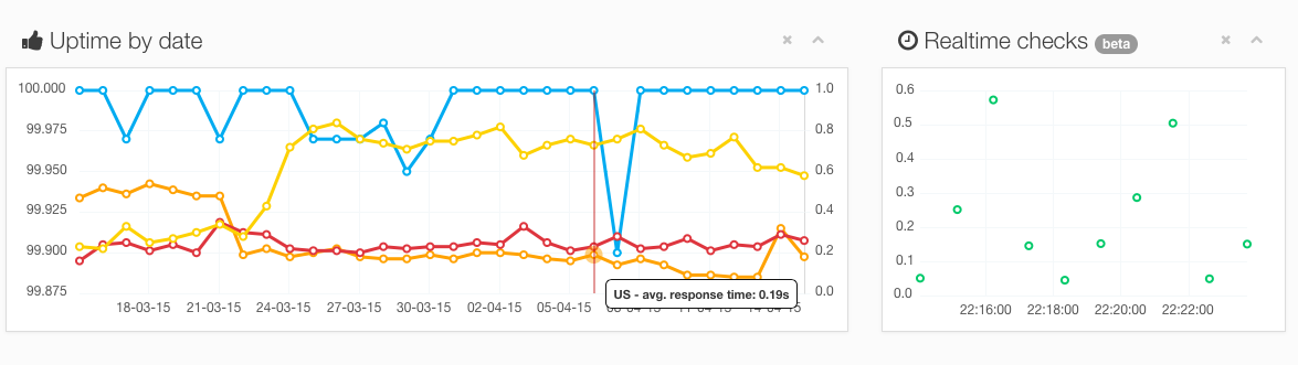
As you can see on the screenshot, we simply added additional data to the existing uptime chart. Those data represent the average response time for your website, grouped by country. You can find it on the test report page.
The blue line has not changed, it’s still an uptime percentage per day. The additional lines are yellow, red and orange. Those show the average response time per day for each country (US, FR and PL).
We also added a tooltip to each line to give you more detailed information about what you see on the screen.
This is the first version of this feature. We are going to enhance it in the nearest future.
No more e-mail flood
While working on the new e-mail notification system, we found out that sometimes something bad happens with our crawlers, and sometimes more than one robot grabs a tests to do an uptime check.
For some (thankfully) edge cases it caused more than one downtime alert.
The edge case was: the robots behave nastily and grab already reserved test to be checked and the website is actually down. Then, two or three robots detect this downtime, and all of them send the downtime notice.
This should not happen again, since we have finally found the real bug in our code.